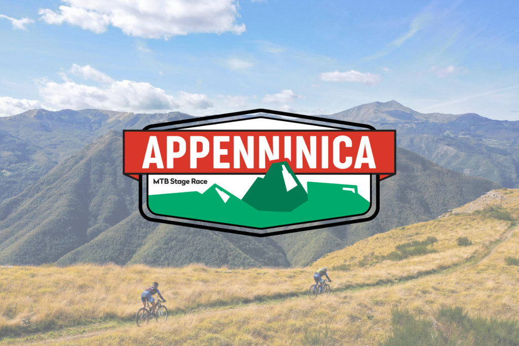
The unique shape of the Emilian mountains is the heart of the new Appenninica MTB Stage Race logo, strengthening the solid relationship between the event and its territories

The Emilia-Romagna Apennines have been the beating heart of Appenninica MTB Stage Race (September 12-18) since its inception. Now, this intense bond is reaffirmed by the MTB stage race’s new logo. The Appenninica organizing committee carried out a significant rebranding, putting the Apennines at the very heart of the new coordinated image.
Part of the territorial promotion strategy developed with the Emilia-Romagna Region, the Appenninica rebranding confirms the MTB stage race’s role as a showcase for the beauty of Apennine areas and a boost for summer tourism, enhancing the trails network and the authenticity of the hospitality.
In the new logo, the Apennines’ lines stand out inside a frame, like a medal, with the renewed lettering of Appenninica surrounded by the green of the woods and pastures of the Emilian mountains.
Designed by the Kipo Studio agency of Reggio Emilia, the new Appenninica coordinated image confirmed the original and distinctive colours of the event, adding an epic touch that suits the over 420 km of length and 16,000 metres of elevation gain of the 2021 edition.
“The new logo enhances the Appenninica DNA and its bond with the area it crosses and promotes. This new image also reinforces the partnership with Emilia-Romagna Region: we are confident of giving a significant contribution in promoting the richness and peculiarities of the Apennines worldwide”, said Beppe Salerno and Milena Bettocchi, organizers of Appenninica MTB Stage Race
